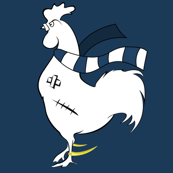
New Logo
You would think creating a new logo would be difficult. A time consuming and expensive thing to do probably. The Olympic 2012 logo, you know the one that looks like Lisa Simpson is performing felatio on her brother, or sick, took months to do and cost £400,000. That isn’t a joke, or tabloid hyperbole, that’s fact. £400k. That’s four Jimmy Greaves and change.
The Fighting Cock logo took a few days. And didn’t cost us anything. This is down to two factors. 1. Case, webmaster to The Fighting Cock, is apparently a design extraordinaire. 2. He works for free out of Flav’s basement – he’s allowed out on Sundays, and to watch the mighty Spurs when they’re on telly.
We don’t have to explain the premise behind the new logo, it should be self-explanatory. Enjoy!


All views and opinions expressed in this article are the views and opinions of the writer and do not necessarily represent the views of The Fighting Cock. We offer a platform for fans to commit their views to text and voice their thoughts. Football is a passionate game and as long as the views stay within the parameters of what is acceptable, we encourage people to write, get involved and share their thoughts on the mighty Tottenham Hotspur.
18 Comments
Would you like to write for The Fighting Cock?
14/11/2011 @ 8:19 pm
Shirts pls and thx. Triffic job!
14/11/2011 @ 8:28 pm
Love the graphic (ten out of ten), poor typography (four out of ten). (Sorry to sound a bitch but I’m honest.)
14/11/2011 @ 8:31 pm
That’s cool. You can never make something that everyone will love. :)
14/11/2011 @ 9:34 pm
Exactly. Don’t get me wring, I’m loving your work.
14/11/2011 @ 9:36 pm
And you can spell “wrong”, unlike me.
15/11/2011 @ 3:44 pm
Personally, I love the shorts
15/11/2011 @ 7:52 pm
Bar the plastic cable ties (?), that logo is the fucking bollocks! Good work fella!
Nothing up with the font either.
15/11/2011 @ 9:03 pm
Noted :)
We may tweak it in the future just to tidy some bits up but it’s something to help spread the podcast a bit for now.
Cheers for the comments.
16/11/2011 @ 1:13 pm
Get some blades round its ankles!
16/11/2011 @ 1:19 pm
Just one more bit of constructive criticism:
The way the scarf is open and jauntily thrown around the cock’s neck is out of kilter with his(?) menacing demeanour.
A scarf knotted, and hanging down at the front would give him more of a ‘I mean business’ look, if you know what I mean?
16/11/2011 @ 2:26 pm
..and it’s facing the wrong way. We should never look east ;-)
16/11/2011 @ 2:44 pm
All good stuff, cheers mate!
16/11/2011 @ 11:26 pm
Love the new logo, great work Case
23/11/2011 @ 1:38 pm
It’s quality. As someone else said, t-shirts, Case!
26/11/2011 @ 4:22 am
I think it’s been mentioned twice already but t-shirts would be a cool idea…. i’d kick in a couple of quid for one…
01/12/2011 @ 8:23 pm
Hear, hear! But remember t-shirts with girl-cut as well.
21/04/2013 @ 5:34 pm
Nice post. I was checking constantly this blog and I’m impressed! Very useful info specifically the last part :) I care for such info much. I was seeking this certain info for a very long time. Thank you and best of luck.
28/05/2013 @ 11:45 am
Simply wish to say your article is as astounding. The clearness in your post is simply excellent and i could assume you’re an expert on this subject. Fine with your permission allow me to grab your feed to keep updated with forthcoming post. Thanks a million and please carry on the enjoyable work.