
Pics were released before he was sold.Why is Nainggolan modelling the home kit?
You are using an out of date browser. It may not display this or other websites correctly.
You should upgrade or use an alternative browser.
You should upgrade or use an alternative browser.
-
The Fighting Cock is a forum for fans of Tottenham Hotspur Football Club. Here you can discuss Spurs latest matches, our squad, tactics and any transfer news surrounding the club. Registration gives you access to all our forums (including 'Off Topic' discussion) and removes most of the adverts (you can remove them all via an account upgrade). You're here now, you might as well...
Latest Spurs videos from Sky Sports
I don't know about a grey home shirt. Who am I kidding, it's better than that gradient shit.How can they get it so badly wrong, had these been the shirts they'd have been top class


Elite vs replica. Any difference?


I think the elite would make the average person look like the below, the replica doesn't look like it hugs the belly so much!
Yeah looking at the sleeve seams they're obv. made to a different cut/fit.

If they got rid of the daft bollocks stripes at the bottom, and change the sponsor to a navy rather than red, they could have a best seller, it's really simple but they really have lost the plot with this, last seasons kit was nice, but again the sponsor ruins it, I got the away one instead.
Indeed. I got the home kit as a gift this year (Typical in that I asked for the away! :Waaaaah: )... TBH, over the course of a season I do become numb to the red-factor but come new kit time hopes re-surface that it'll be gone all over again.
Third kits should always be a wildcard, something that harks back to the navy and purple, or the mad yellow kits of the 90's would be fun, for the kids of course
None of that horrible pissy yellow colour from a couple of years back... Nice bright, full bodied yellow pls.... Be forthright with the shade of purple too (see last years 3rd that kinda masquerades as dark blue anyway & the nearly Chelsea-blue 'purple' a few years back.).
Nice touch.
a nicer touch would have been removing the horizontal heritage stripes......
ALL THE NEW SEASON'S DESIGNS ARE FUCKEN PISH
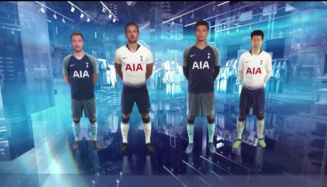
Eriksen drew the short straw then...
New polo shirt looks nice.
Could just be because Davinson is wearing it though.

I think it looks OK. Not as clean as I prefer but paired with blue shorts looks Spurs to me.a nicer touch would have been removing the horizontal heritage stripes......
The away kit on the other hand is shite, the state of those fucking green shorts!! WTF is all that about?
Only potential issue I see is what the Home shirt looks like with white shorts.
I'm talking about the home kit. You'd never see Madrid having such a god awful home jersey as ours is this year so I don't see why we have to make a such a pigs ear of ours.
If you're going to experiment that's what the away and 3rd kits are for. A bit of piping, a change in colour our something going on on the sleeves or back of the home shirt should be the most daring a home kit should be when experimenting max!
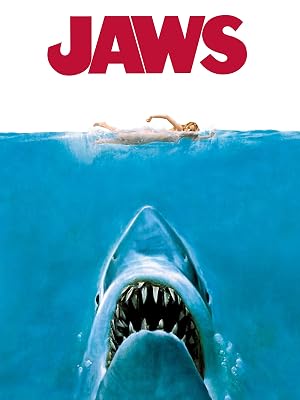
I still can't get the Jaws gif from earlier in this thread outta my head:
I'm sure it won't be long before someone mocks up a version without the ridiculous gradient at the bottom of the shirt and we'll all agree how much better it looks
EDIT:
found one

Rocket.Science.
Not. :dembelewtf:
Edit: Truth be known, I think a little bit of 'something' helps take some of the red 'away', but that's bollocks and only made worse by the wanky design concept they're banding about to support it (pardon the pun).
Last edited:
Rocket.Science.
Not. :dembelewtf:
You'd think so, wouldn't you
 ochfacepalm::avbfacepalm:
Interestingly, Kitbag has a long sleeve version of the home shirt.
Tottenham Hotspur Home Stadium Shirt 2018-19 - Long Sleeve | Kitbag
Can buy the long sleeve on Nike.com. Just purchased the abominations for my kids. Name and number printing seems to be free of charge.