No, you’ve added an additional layer to blur the lines and avoid my point. If tackles-to-fouls ratios are similar across teams then fair enough, but that is not the argument. The issue is the foul-to-yellow card ratio afterwards, where Spurs are clearly being punished far more harshly whilst Woolwich are getting a far more lenient threshold.
You only need to look at some of the reds we’ve received compared to what others have got away with in similar situations. The consistency is not there.
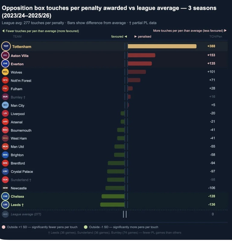
Same with penalties. Being 5th for touches in the box and having zero penalties could maybe be dismissed in isolation, but it is not in isolation. When you combine that with the yellow card stats and red card discrepancies, it starts to show a pattern rather than just random variance.
People keep shouting out of context about the chart, but context works both ways. You cannot dismiss every stat individually whilst ignoring the cumulative picture they create together.
Not really.
Players are more likely to get booked the more fouls they make for example.
The more tackles you make, the more likely you are to foul the more fouls you make the more likely you are to get booked. Especially if it is the same player making fouls multiple times in a game.
That said, it is true Woolwich are the outlier here - but we are not in the slightest - statistically we have a very typical ratio compared to most of the table there....
Woolwich getting preferential treatment? OK this is a compelling start to figuring that out - us getting worse treatment - i dont see it