
You are using an out of date browser. It may not display this or other websites correctly.
You should upgrade or use an alternative browser.
You should upgrade or use an alternative browser.
-
The Fighting Cock is a forum for fans of Tottenham Hotspur Football Club. Here you can discuss Spurs latest matches, our squad, tactics and any transfer news surrounding the club. Registration gives you access to all our forums (including 'Off Topic' discussion) and removes most of the adverts (you can remove them all via an account upgrade). You're here now, you might as well...
Latest Spurs videos from Sky Sports
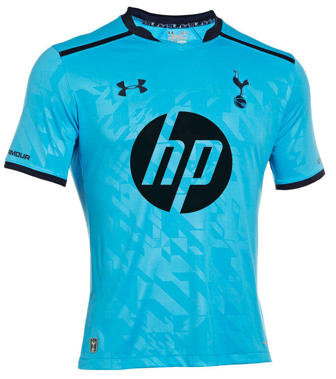
The light blue on top of the light blue would just be a kit with no sponsor?...
Well, I'd be ok with that... but anyway, I just don't understand the statement that the home kit sponsor color "clashes" with the blue trim.
Did we not play In a blue kit once for one game at home teddy sheringham last game for us?
Did you buy socks?Just bought my Bale home kit. In hindsight, I probably should've waited until we're sure Bale won't be sold...
Well, I'd be ok with that... but anyway, I just don't understand the statement that the home kit sponsor color "clashes" with the blue trim.
The trim, badge, and UA logos are all a dark blue, but the HP one is light blue on the home. On the away, all of them are dark blue, so I think he's wondering why the HP logo on the home isn't a darker blue.
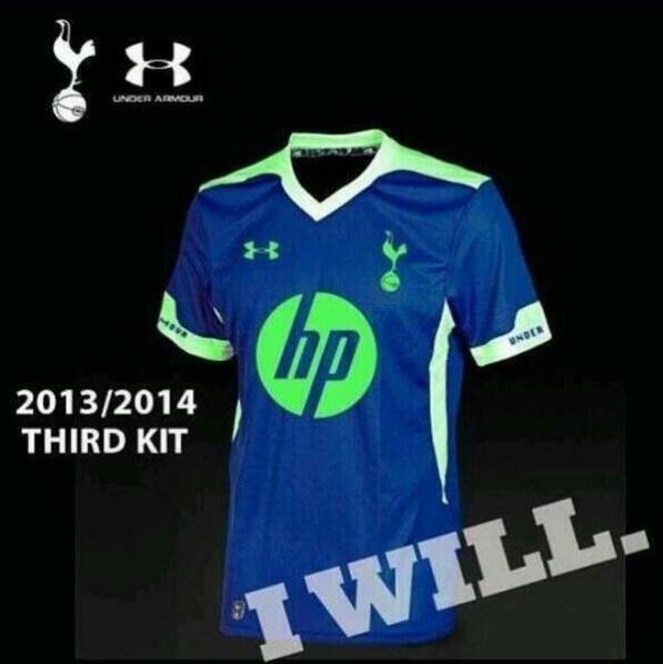
supposed third kit

Wow
supposed third kit

Flav
The Fighting Cock
Did we not play In a blue kit once for one game at home teddy sheringham last game for us?
We've had loads of blue kits. Not a massive fan of this shade though
now we know where the lime green tinge on the training kits comes from:harryfacepalm:
Is that a joke because it looks it that will be up there with the worst Tottenham kits :gylfi: green Tottenham badge
Well, I'd be ok with that... but anyway, I just don't understand the statement that the home kit sponsor color "clashes" with the blue trim.
Because the home kit is white with navy blue trim/detailing.
whereas the away kit is capri with navy blue trim/detailing.
On either kit, the two colours provide a nice contrast...but it's not just two colours on the home kit, we have white, navy blue AND Capri/Cyan/Aquamarine/Duck egg/whatever shade of blue it is (I know, you should see me trying to pick out a paint for the kitchen!).
I'm just of the thinking, if HP don't mind what shade of Blue their logo is (as is the case on the away kit)...could we not have matched the logo on the home kit to the Blue trim?!

Pony did it and they were....er, pony!
This kit makes me think Chris Waddle for some reason
supposed third kit
Doesn't having 2 Blue kits kind of defeat the object of having a 3rd kit?
I really love both kits ... the away design and the hp logos are really growing on me ... and the home ... well, it's simply a class act.
I just cant wait to finally get my first spurs (home) jersey .... !!!!!
Anyway, here's Paulo in the kit ... looks nice and it also shows that these kits may be looser than last years or just that ... a larger size won't look too bad.
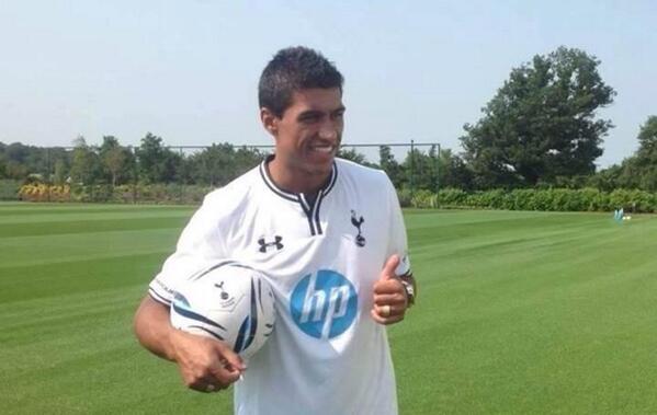
Or maybe Levy got confused and thought he was signing Hulk?

I didn't know James Corden was a yank
Because the home kit is white with navy blue trim/detailing.
whereas the away kit is capri with navy blue trim/detailing.
On either kit, the two colours provide a nice contrast...but it's not just two colours on the home kit, we have white, navy blue AND Capri/Cyan/Aquamarine/Duck egg/whatever shade of blue it is (I know, you should see me trying to pick out a paint for the kitchen!).
I'm just of the thinking, if HP don't mind what shade of Blue their logo is (as is the case on the away kit)...could we not have matched the logo on the home kit to the Blue trim?!
Pony did it and they were....er, pony!
I'm going to give up on this one after this but, if capri blue and navy don't "clash" on the away kit they don't "clash" on the home kit. So the correct statement would be" the away kit is capri w/navy blue trim/detailing and the home kit is white with navy blue and capri blue trim/detailing(counting the sponsor).
It way less of a stretch than having Thompson and Mansion in FUCKING RED on the home shirts. It's a nice kit, the capri blue sponsor is whatever, but sponsors in general are whatever. If we are down to the point to whhere all we have to complain about is the home sponsor logo being made to match the away kit for consistency's sake, then we are doing OK in my opinion.
supposed third kit
 :dawsonwtf:
  :lennon: :naughton: :walkerwtf: