
I don't like it very much but I think 2005/6

and
2009/10

were worse maybe
05/06 was an aborted fetus.
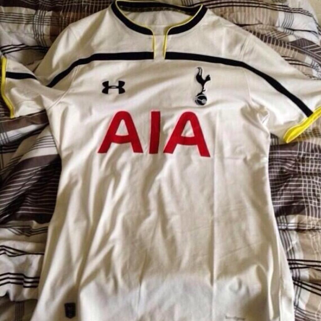
09/10 was nowhere near as bad. I never liked the red in the Mansion logo, but it's better than AIA's repulsive one.
I fucking hate AIA's logo. It looks like a 13 year old designed it in 1997. Nevermind the color, the font is absolutely horrendous. Can you fucking imagine if they get naming rights to the new stadium? Fuck me, they would risk the place getting burned down if they put that diaster of a logo up.


") )
)