
This bigger question here is, why on Earth were you watching Grange Hill?!
I'm gonna assume you're over 12.
I'm gonna assume you're over 12.
The Fighting Cock is a forum for fans of Tottenham Hotspur Football Club. Here you can discuss Spurs latest matches, our squad, tactics and any transfer news surrounding the club. Registration gives you access to all our forums (including 'Off Topic' discussion) and removes most of the adverts (you can remove them all via an account upgrade). You're here now, you might as well...
There are some missing from this list (ETA a couple of additional images from Historical Football Kits, which appear to contradict other sources):


I have a story about that Crest...I actually like the 97-99 crest, it has a regal feel to it
I've seen worse on tattoos
From a design perspective, I love our current one. Emotionally, it's the one on our '78 Admiral kit (which just happens to be quite similar), since that was my first.That 97-99 badge is the most memorable for me... purely because I had it on my duvet and pillow set and wallpaper as a kid!
![Spurs%201978%20Terry%20Naylor%20Match%20Worn[1].jpg](http://www.admiralmatchwornshirts.com/photos/The-Admiral-Golden-Cl/Spurs%201978%20Terry%20Naylor%20Match%20Worn[1].jpg)
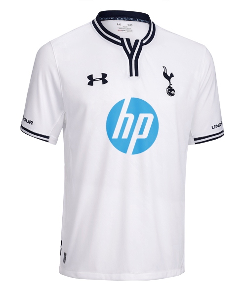
My favourite of recent years actually has to be the 2013-14 kit, only one since 2002 that didn't have any red on it:From a design perspective, I love our current one. Emotionally, it's the one on our '78 Admiral kit (which just happens to be quite similar), since that was my first.
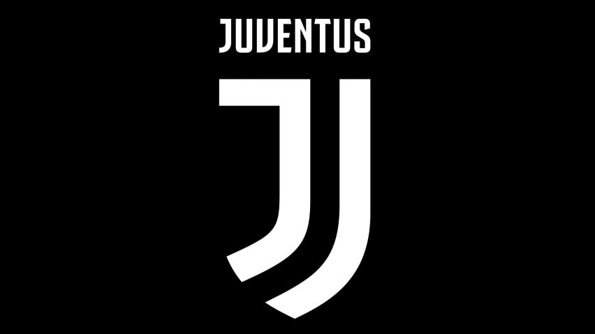
Not sure I agree with this mate. I love Juventus' new identity (from a graphic design perspective) and am surprised it received such a lukewarm reception. But I actually think they followed our lead in creating what you might describe as a lifestyle-type brand rather than a purely sports brand.Our current logo is already 12 years old and I reckon it's time for a change. Something like Juve's logo would be nice:
That's an absolute beautyFrom a design perspective, I love our current one. Emotionally, it's the one on our '78 Admiral kit (which just happens to be quite similar), since that was my first.
My favourite of recent years actually has to be the 2013-14 kit, only one since 2002 that didn't have any red on it:
Shame it was such a rancid season!
Ah, ok.I was obviously joking, our current logo is nearly perfect as far as I am concerned.

That 97-99 badge is the most memorable for me... purely because I had it on my duvet and pillow set and wallpaper as a kid!There are some missing from this list.
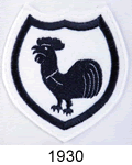
1921-1951
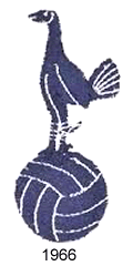
1951-1967
1967-1983
1983-1995

1995-1997
1997-1999
1999-2006
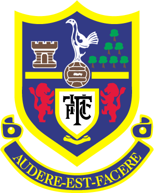
2006 - Present

My favourite of recent years actually has to be the 2013-14 kit, only one since 2002 that didn't have any red on it:


