Let’s not get crazy here.

The Fighting Cock is a forum for fans of Tottenham Hotspur Football Club. Here you can discuss Spurs latest matches, our squad, tactics and any transfer news surrounding the club. Registration gives you access to all our forums (including 'Off Topic' discussion) and removes most of the adverts (you can remove them all via an account upgrade). You're here now, you might as well...
Let’s not get crazy here.
You should be working at Nike!Blimey .. ALREADY??
WHITE/NAVY home
NAVY/WHITE away
ALL YELLOW or SKY BLUE
3rd
CHOCOLATE & GOLD 4th kit... Just for the Historians!
Literally how hard can it be?

On the pitch too!We need a yellow kit the issue with a navy + sky blue is if we face a Blackburn, West Brom QPR we’re fucked

Dark blue should be the modern standard for the away kit.... Always looks classy. At which point; have some fun with the 3rd kit..... We'll rarely see it much anyway.
.........Though a return of yellow for the 3rd kit would be welcome.
Oh boy, here we go....... already!!

Tottenham 25-26 Home Kit Released
Update: Tottenham Hotspur have officially unveiled their 2025/26 home kit, continuing a legacy that spans over a century.www.footyheadlines.com
Fucking sweet and easily the best of the three.
Juventus have an alternative kit this year that is black with gold for the crest and brand logo. It looks great.Can hardly imagine better colour combination. Might be a shirt I'll buy. Only shame that stupid shirt sponsor we currently have would stop any design from becoming a classic (and I don't only mean the colour)

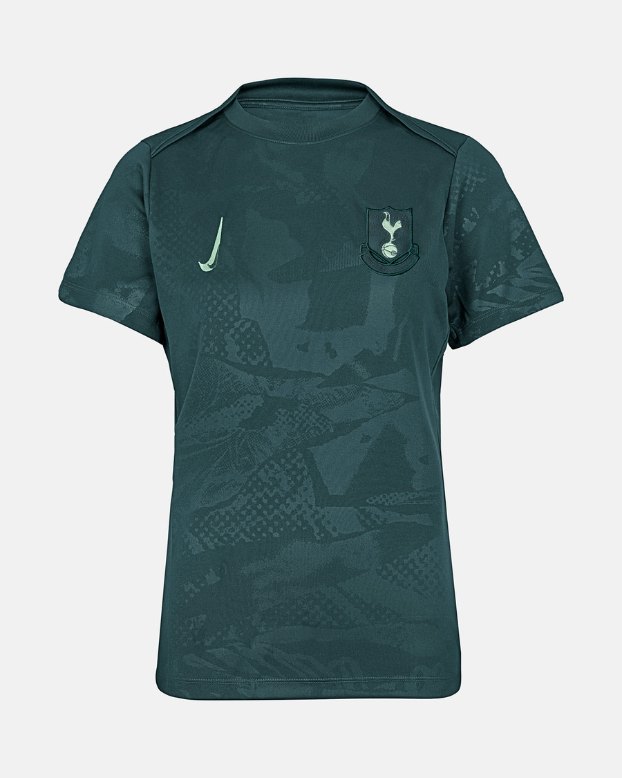
 www.tottenhamhotspur.com
Honestly thought that was some tongue in cheek made up fan shit. Just checked the online shop and it’s there! The whole Nike Tottenham range is just a random collection of tat. They’ve been awful for us.
I miss Under Armour. But they've gotten out of football.Honestly thought that was some tongue in cheek made up fan shit. Just checked the online shop and it’s there! The whole Nike Tottenham range is just a random collection of tat. They’ve been awful for us.
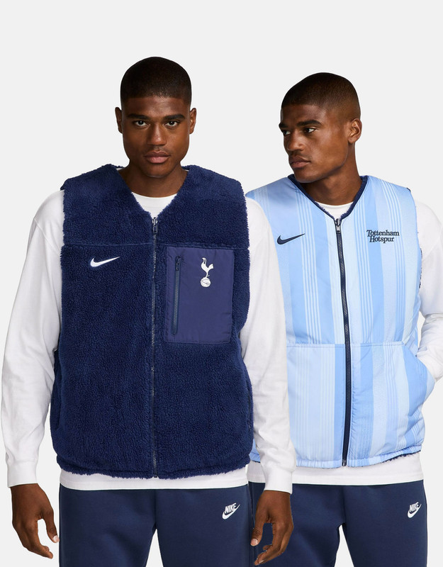
With a pocket? That would be truly mad.
WTF? I used to wear something like that under my dry suit in winter.
For some clubs they seem to turn out quite smart, classic stuff… but ours is honestly crap. I haven’t bought anything this season. I thought Nike would be all about classic, high quality sports gear.I miss Under Armour. But they've gotten out of football.
I'd love Puma or Hummel once the Nike deal is up.
Umbro seem ok these days. Adidas are pretty good too (some minging new in there mind).I miss Under Armour. But they've gotten out of football.
I'd love Puma or Hummel once the Nike deal is up.