Our 2013-14 Home Kit “drops” 8 July

  • The Fighting Cock is a forum for fans of Tottenham Hotspur Football Club. Here you can discuss Spurs latest matches, our squad, tactics and any transfer news surrounding the club. Registration gives you access to all our forums (including 'Off Topic' discussion) and removes most of the adverts (you can remove them all via an account upgrade). You're here now, you might as well...

    Get involved!

Latest Spurs videos from Sky Sports

The Red looks Vile we all know this BUT u have to think how much money is behind that fucking disgusting red logo???? Im guessing a hell of a lot. We r building something massive if the worse thing we have to worry about this season is the red on our Cup kits then fuck me im more than happy with it!!

BUT i say again its fucking vile!!

If it's between £85 and £105million, then we won't be needing the Madrid 'credit-card/loan-shark' money after all!!
 
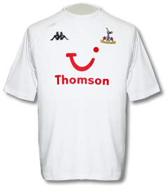
It takes me back to the Thomson days

tottenham-kappa-tottenham-hotspur-home-04-05.gif
 
Trust Spurs fans to have a meltdown over a colour. Fuck me.

Never understood this sentiment.
Its like when I see Spurs fans in red tops at the fucking NLD???

Madness

You think its not important, but if you look at gang culture (extreme I know!), its something that can get you killed.

Its not just a kit, its not just a sponser and its not just some red letters. It is the thing, first and foremost, alot of people associate with Woolwich, and I dont like it across our shirts.
 
If we are to become a team that wins trophies again and competes, we (the fans) HAVE to drop that mentality, especially in relation to Woolwich. It makes us look small, and IMO its pointless.

I understand shirt colour. A red shirt wouldn't be Spurs, but a few letters on a cup shirt....seems a pointless argument. And if it brings us cash, then fuck it.
 
Last edited:
Hate red on the shirt. But looking beyond that, these sponsorship deals may well be where the extra money is coming from to turn us into a potential title challenging side this season so if that's the case then I will grudgingly bare it.

Edit: I would be devastated if they were our stadium sponsor though. Devastated!
 
Putting the red thing to one side you would have thought that a company that is paying millions to be our sponsor could afford to get a graphic designer to come up with some sort of logo....

... Or at least use a decent font.

I like Helvetica and Geneva... And if the mood suits and I'm feeling frisky, American Typewriter
 
^ Yeah the logo itself is properly shite. But I just don't understand the red thing anymore. Just as I don't have a hernia every time someone mentions....

:cunt:
 
It really does make you wanna go out in the first round/qualifiers doesn't it?? THAT'LL show em!

#sabotagethecupsthisyearsowecanavoidhavingtoseethatawfulredlogo.com!!!

(I can't believe this has come up as a genuine link... FFS, IT'S A JOKE HASHTAG #JOKE!!!

:harrylick:
 
Putting the red thing to one side you would have thought that a company that is paying millions to be our sponsor could afford to get a graphic designer to come up with some sort of logo....

... Or at least use a decent font.

I like Helvetica and Geneva... And if the mood suits and I'm feeling frisky, American Typewriter

This, it just looks rubbish, it would look rubbish in blue, it would look rubbish in brown, but the fact it's red makes it just a little bit worse.
 
Back
Top Bottom