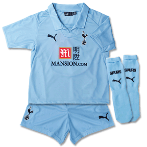
I liked last years better tbh. I am a fan of the navy shorts/socks on the home kit though. I dont mind either kit but I wont be getting either.
Hopefully the 3rd kit looks nice.

That's what's doing the rounds on Twatter. A fake I hope.
The Fighting Cock is a forum for fans of Tottenham Hotspur Football Club. Here you can discuss Spurs latest matches, our squad, tactics and any transfer news surrounding the club. Registration gives you access to all our forums (including 'Off Topic' discussion) and removes most of the adverts (you can remove them all via an account upgrade). You're here now, you might as well...
I liked last years better tbh. I am a fan of the navy shorts/socks on the home kit though. I dont mind either kit but I wont be getting either.
Hopefully the 3rd kit looks nice.

Will be waiting for the Investec shirt to come out... That will look the mustard
I don't understand why everybody is so angry about having green. Things don't have to be the same every single year. I quite like the cyan away uniforms and the cyan logo is growing on me. New and different isnt always bad.

That's what's doing the rounds on Twatter. A fake I hope.
I just wanted to do a bit of a check. It appears only thee of the ninteen (why the fuck 19 across two leagues remains a mistery) do not have a sponsorship on their shirts. And I am counting the fucking huge red bull logo on the new york kit. So surely this guy has at least seen an MLS shirt with sponsorship on it somewhere..My duality of feelings is just weird. I love the home, massively prefer it to last year's. However, I've made it pretty clear how I feel about the color choice of the away.
What will be interesting to see is how people here in the US react to seeing someone walking around in one of these. Most of the sponsors over the years for the big clubs are either brands people don't recognize here, or the coloring is such that they aren't noticeable. As some of you may know, sponsors are not allowed to slap their shit all over jerseys in professional sports here. So what we have now in this situation is a sponsor emblem that is A) recognizable here and B) stands out like a fiend on the shirt. For example, I sent the picture of the away to a non-football following friend to make fun of it, and his response was, "Holy fucking shameless branding. Their printers blow." Only after pointing out to him that sponsor display is typical in European professional football, did he make comment on the color.
Not something major, but will still be interesting to see the response.


I don't think that dude he's talking about has seen a minute of an MLS game.I just wanted to do a bit of a check. It appears only thee of the ninteen (why the fuck 19 across two leagues remains a mistery) do not have a sponsorship on their shirts. And I am counting the fucking huge red bull logo on the new york kit. So surely this guy has at least seen an MLS shirt with sponsorship on it somewhere..
Okay, perhaps good was a bit too far but I still think this

looks far better than the likes of these:


False choice. Short shorts only look good on women, you dunce.


I don't think that dude he's talking about has seen a minute of an MLS game.
This. MLS receives very little coverage in the media here. Fella in all likelihood could not name a single MLS team.