I've seen some clubs with both the manufacturer badge and the club badge centralised, it somehow endeavours to look even worse.I'm a weirdo, but i like this one!!
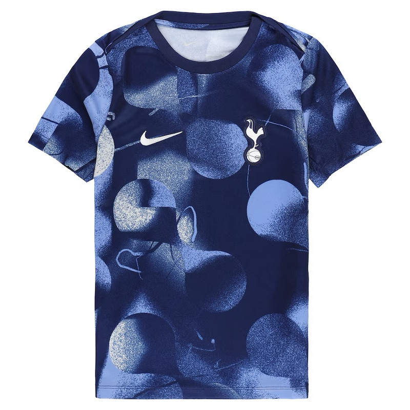
But who in their right frame of mind decides to put the club logo in the middle, AND keep the Nike logo on the side???
I like the colour scheme for the away kit but the stripes are off-putting and I really don't get the yellow bands on the sleeves, really unclean look to it.