
Surely anyone with some common sense would realise that, we AREN'T going to have a 3rd kit the same colour as the 2nd kit...
You are using an out of date browser. It may not display this or other websites correctly.
You should upgrade or use an alternative browser.
You should upgrade or use an alternative browser.
-
The Fighting Cock is a forum for fans of Tottenham Hotspur Football Club. Here you can discuss Spurs latest matches, our squad, tactics and any transfer news surrounding the club. Registration gives you access to all our forums (including 'Off Topic' discussion) and removes most of the adverts (you can remove them all via an account upgrade). You're here now, you might as well...
Latest Spurs videos from Sky Sports
Because the home kit is white with navy blue trim/detailing.
whereas the away kit is capri with navy blue trim/detailing.
On either kit, the two colours provide a nice contrast...but it's not just two colours on the home kit, we have white, navy blue AND Capri/Cyan/Aquamarine/Duck egg/whatever shade of blue it is (I know, you should see me trying to pick out a paint for the kitchen!).
I'm just of the thinking, if HP don't mind what shade of Blue their logo is (as is the case on the away kit)...could we not have matched the logo on the home kit to the Blue trim?!

Pony did it and they were....er, pony!
because of brand identity!
hp's logo is in fact—gasp—cyan, so it's cyan on the home shirt (as in the only kit that really matters, it's the club's identity). back in the pony days it wasn't so it was a matching navy.
if you were a business that paid a design agency a shitload of money to update your identity and then deployed it worldwide, aaand then paid to be the shirt sponsor for a football team—would you be alright with them changing the colour to suit?
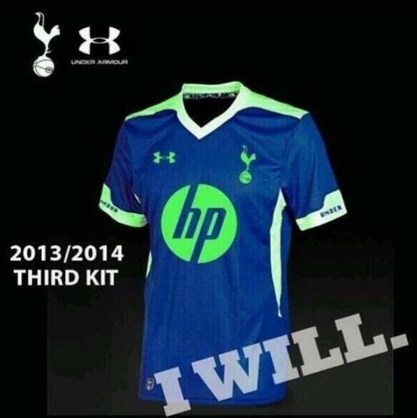
supposed third kit
I want to scream fake, but if it is the person who deisgned it took care to add in some small details like the cockerel tag on the botton of the shirt. It's different enough from the change and it incorporates the neon green that is being used in the training gear. It wouldn't totally shock me if this is legit.
I'm going to give up on this one after this but, if capri blue and navy don't "clash" on the away kit they don't "clash" on the home kit. So the correct statement would be" the away kit is capri w/navy blue trim/detailing and the home kit is white with navy blue and capri blue trim/detailing(counting the sponsor).
It way less of a stretch than having Thompson and Mansion in FUCKING RED on the home shirts. It's a nice kit, the capri blue sponsor is whatever, but sponsors in general are whatever. If we are down to the point to whhere all we have to complain about is the home sponsor logo being made to match the away kit for consistency's sake, then we are doing OK in my opinion.
Oh but I'm I'm not down to the point where all I have to complain about is the logo being a shit shade of Blue...that is just where I've chosen to start!!
I don't like the collar becau....
...

i know the 3rd shirt is an excuse for manufacturers to have a bit of a good time and experiment with colours and designs
but don't we have an established kinda rule about the 3rd strip? It used to be that the away and 3rd were alternated between blue (light and dark), yellow or purple. tbh i quite liked the chocolate puma one too, but it seems like with under armour they don't much care.
the black and grey thing from last year says anything but tottenham to me, and now the same with this green bollocks
supposed third kit
After last season's kits I really thought Under Armour would be a good fit for us. However after seeing this awful piece of shit, I can't help but think otherwise ...
because of brand identity!
hp's logo is in fact—gasp—cyan, so it's cyan on the home shirt (as in the only kit that really matters, it's the club's identity). back in the pony days it wasn't so it was a matching navy.
if you were a business that paid a design agency a shitload of money to update your identity and then deployed it worldwide, aaand then paid to be the shirt sponsor for a football team—would you be alright with them changing the colour to suit?
If I'd paid a design agency a shitload of money to update my identity I'd want something better than a Cyan blob! Mind you, if I were HP I'd try to make better fucking printers before worrying about branding!!
They haven't even changed the logo really have they. The circle with HP in it, is the same on both kits... Just the old one has some square brackets around it.
Quite like home and away kit, especially the collar on the home.
That supposed 3rd kit colour reminds me of the Ajax away kit from last season
That supposed 3rd kit colour reminds me of the Ajax away kit from last season
Two kits have been officially announced yet we're still speculating over possible photoshops of the 3rd kit :lloris:
The supposed third kit is just an edited version of this Adidas template.

Phew
Has to be yellow for the 3rd
I am still expecting green on the 3rd unfortunately ...
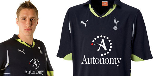
A bit like this kit ..
Green should never be in our color scheme. Not that I think cyan should either, but I'll take it over green.
Since the two kits we've seen are relatively light colored, I'm rather safely assuming (as I'm sure most of you are) that the 3rd will be a dark color scheme. Surely navy with white and cyan trimming?
Since the two kits we've seen are relatively light colored, I'm rather safely assuming (as I'm sure most of you are) that the 3rd will be a dark color scheme. Surely navy with white and cyan trimming?

because of brand identity!
hp's logo is in fact—gasp—cyan, so it's cyan on the home shirt (as in the only kit that really matters, it's the club's identity). back in the pony days it wasn't so it was a matching navy.
if you were a business that paid a design agency a shitload of money to update your identity and then deployed it worldwide, aaand then paid to be the shirt sponsor for a football team—would you be alright with them changing the colour to suit?
There logo isn't really cyan though, certainly not as bright as it is on the kit. It's a light blue but more sky blue.
They also use this for a lot of branding and it would be absolutely fine

