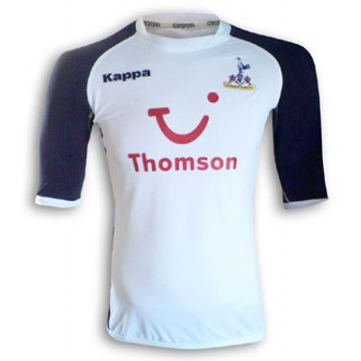
much preferred that to the roadkill - miss world - tyre tread - sash stripesImo, the worst home kit under armour gave us was this.
thats a pretty high standard for the worsyt...

You are using an out of date browser. It may not display this or other websites correctly.
You should upgrade or use an alternative browser.
You should upgrade or use an alternative browser.
-
The Fighting Cock is a forum for fans of Tottenham Hotspur Football Club. Here you can discuss Spurs latest matches, our squad, tactics and any transfer news surrounding the club. Registration gives you access to all our forums (including 'Off Topic' discussion) and removes most of the adverts (you can remove them all via an account upgrade). You're here now, you might as well...
Latest Spurs videos from Sky Sports
The Harry Kane kit!Imo, the worst home kit under armour gave us was this.
thats a pretty high standard for the worsyt...

Kappa were an abomination and as said just previously those Tottenham fans with erm....fuller figure they were NOT for younothing wrong with a wee bit of trim. its when you get efforts like this that its an abomination

im one of them. i used to look like i jhad a pillow in front of the shirtKappa were an abomination and as said just previously those Tottenham fans with erm....fuller figure they were NOT for you
and cos i had long hair, from behind i looked like a fat Ginola
A tiny bit of blue trim is ok. But bringing on to the face of the shirt in any way - swoosh stripes, weird fade outs, full on blue sleeves, piss stain partitions - is off for me. The leaks for next year make me like this season’s one a bit. But just a bit.nothing wrong with a wee bit of trim. its when you get efforts like this that its an abomination

im one of them. i used to look like i jhad a pillow in front of the shirt
and cos i had long hair, from behind i lookedlike afatGinola
I have this one and the last under armour kits. Only spurs kits I own. If we ever go for colored sleeves again I would not say no to something similar to what Valencia have now (but white and navy instead of white and black)Imo, the worst home kit under armour gave us was this.
thats a pretty high standard for the worsyt...

I have this one and the last under armour kits. Only spurs kits I own. If we ever go for colored sleeves again I would not say no to something similar to what Valencia have now (but white and navy instead of white and black)
Coloured sleeves are a no go for me. Just end up like a reverse Woolwich kit in white and navy. Our jersey since 1898 has predominantly been plain lilywhite, Admiral first added bits of navy trim with their home kit design in the late 70s.
Heaven preserve us!
I think it looks terrible with the whole kit. The belt blending with the shorts makes it look like they’re wearing fucking rompers, or have tried to hike their shorts up around their nipples. Looks like a bad cartoon.
All a bit: 'Simon Cowell' if you ask me!
:hugoshock:

All a bit: 'Jack The Ripper' if you ask me!
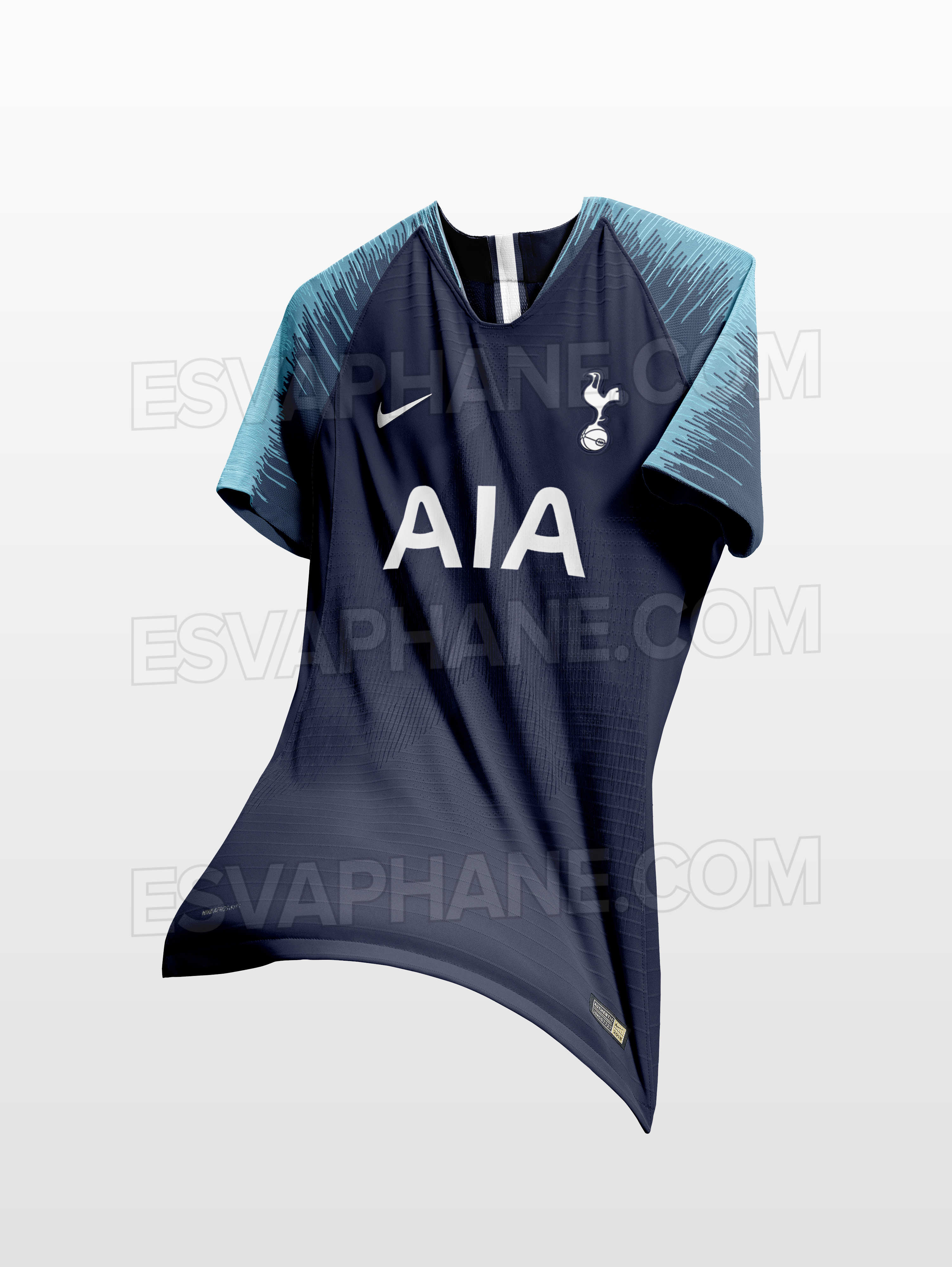
Really don’t like those paint streaks/seismic readings on the sleeves of the Away and 3rd tops 
Have been buying the 3rd shirts the past few seasons but looks like I’ll be giving it a miss this year.

Have been buying the 3rd shirts the past few seasons but looks like I’ll be giving it a miss this year.
Really don’t like those paint streaks/seismic readings on the sleeves of the Away and 3rd tops
Have been buying the 3rd shirts the past few seasons but looks like I’ll be giving it a miss this year.
It's Nike's template.
They're on the Home shirt too, they're just white.
I agree. I like the colour of the third but the sleeve design really isn't necessary.Really don’t like those paint streaks/seismic readings on the sleeves of the Away and 3rd tops
Have been buying the 3rd shirts the past few seasons but looks like I’ll be giving it a miss this year.
Weirdly, out of the three I probably prefer the home. But not enough to own it. Not a great season all-round kit-wise.
I really like the sleeves.
If they'd follow suit with the sleeves but plain shirt as the 2nd and 3rd the home shirt would have been a work of art.
Looks like I have a different opinion!
The front of all three shirts look like they're made out of BRAILLE!!


