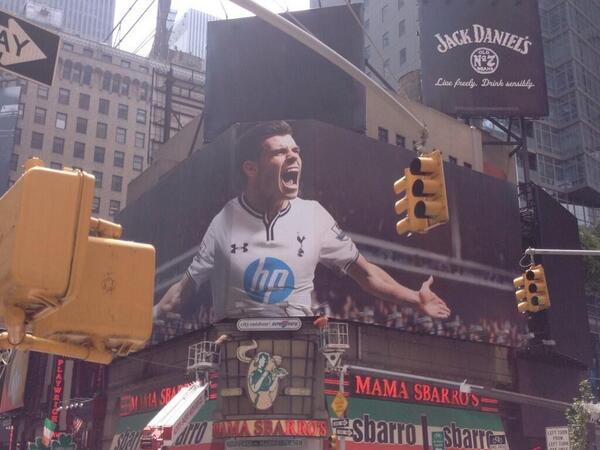
I'm sure that's right, but, I'm not so enthusiastic about the monochrome look, precisely because the sponsor blends more into the shirt as a whole. We look beholden to HP or something...I'm sure it was more of an HP thing than a UA or THFC thing.
Although perhaps it's only this specific logo (being circular rather than a banner legend), since I don't see the same effect from, say, Chelsea's Samsung, which is the same colour as all the details in the shirt.
Or perhaps it's since, in HP's case, the contrasting colour is negative space.
Though I don't have this reaction to the cyan shirt...


 :walkerwtf: :llorisserious: