
You are using an out of date browser. It may not display this or other websites correctly.
You should upgrade or use an alternative browser.
You should upgrade or use an alternative browser.
-
The Fighting Cock is a forum for fans of Tottenham Hotspur Football Club. Here you can discuss Spurs latest matches, our squad, tactics and any transfer news surrounding the club. Registration gives you access to all our forums (including 'Off Topic' discussion) and removes most of the adverts (you can remove them all via an account upgrade). You're here now, you might as well...
Latest Spurs videos from Sky Sports
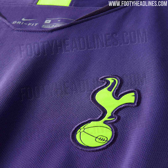
It looks so shoddy. The badge looks like a kid has cut it out of a sticker book and attached it on with pritt stick. its not even flush to embroidering.
Shockingly poor.
How good would that home shirt look without the blue at the bottom. Perfection.
ah well
So, last seasons then..
Welp
Anyone else think “get the fuck on with it” while watching that?

So, last seasons then..
Yeah give or take, I guess.
Weirdly (IF the Green monstrosity WAS to be our 3rd kit) then why not use THAT for The GK kit, which should IMHO always be Green!?Hugo's new kit apparently
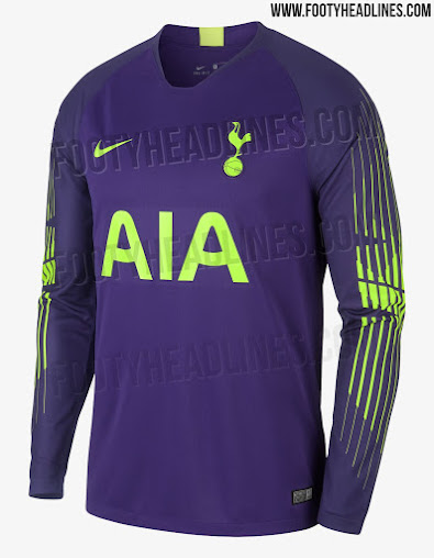
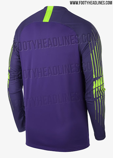

Then the Nike 'blurb' merchants could try explaining the N17 Map print as some kind of "NONE SHALL PASS" symbolism, which is why they gave it to a GK!
How good would that home shirt look without the blue at the bottom. Perfection.
ah well
It makes them look like they’ve pulled their shorts up really high and looks ridiculous.
First kit in years I’ve taken a strong dislike to.
The excuse explanation behind the design:
....the design ideas for this season’s home and away kits come from the much-anticipated move into our world-class new stadium, along with the characteristics of our vibrant young team.
The 2018/19 Nike Spurs home shirt features a striking Lilywhite and navy blue print. In combination with the navy blue shorts and blue and white socks graphic, the design is intended to subtly reference the architecture of the new stadium while creating a dynamic head-to-toe gradient that reinforces the underlying explosive energy of our players.
The new kit skilfully balances our modern identity with our rich history. To this end, an inner pride message features on the inside of the collar of the new Spurs home shirt, displaying the postcode and coordinates of the centre circle at our former home, White Hart Lane.
What utter, UTTER pretentious bullshit from Nike that is!
I don't even think THEY believe it!
It reads like a 13 year old trying to explain to his Mother why all his socks are stuck together!
Why it took so long to announce: They spent weeks in the studio retaking the pictures, trying to work around the moire effect. Then they gave up and used the funky looking pictures anyway. Those lines are gonna bounce around like mad on TV.
I don't mind the away kit though.
I don't mind the away kit though.


 ochfacepalm:
Anyone else think “get the fuck on with it” while watching that?
100%
Too much unnecessary shit going on all round with the promo AND the kits. Just dial it back a bit for fuck's sake.
It looks better on(Harry kane) ,than off.Close one eye and squint with the other and it just looks like we have massive shorts.
Some guy in marketing has clearly just watched Tron for the first time.Anyone else think “get the fuck on with it” while watching that?
Still, cringe-making shit it may be, but at least a major signing will now be announced, the internet said so.

Nike are absolutely shit, should stick to making trainers, I'll be wearing me retro shirts or polo shirts.

The problem with plain white shirts is they look like basic t-shirts and so we'll always have kit manufacturers trying to do something to make it stand out. I've not really got an issue with that, as it keeps it interesting and makes it stand out.
The only gripe I have is the use of the exact same template for every single team. They've dabbled with similar templates in the past, but this last three years have been the worst for that. At least Adidas have a few current templates to choose from, and they mix them up a bit.
The only gripe I have is the use of the exact same template for every single team. They've dabbled with similar templates in the past, but this last three years have been the worst for that. At least Adidas have a few current templates to choose from, and they mix them up a bit.