Oh hello gorgeous!!!
...if we did go down, it would, by definition (and somewhat ironically) seriously suck!

The Fighting Cock is a forum for fans of Tottenham Hotspur Football Club. Here you can discuss Spurs latest matches, our squad, tactics and any transfer news surrounding the club. Registration gives you access to all our forums (including 'Off Topic' discussion) and removes most of the adverts (you can remove them all via an account upgrade). You're here now, you might as well...
Oh hello gorgeous!!!
...if we did go down, it would, by definition (and somewhat ironically) seriously suck!
Blue & Red... White, Red & Blue... Black, Red & Blue...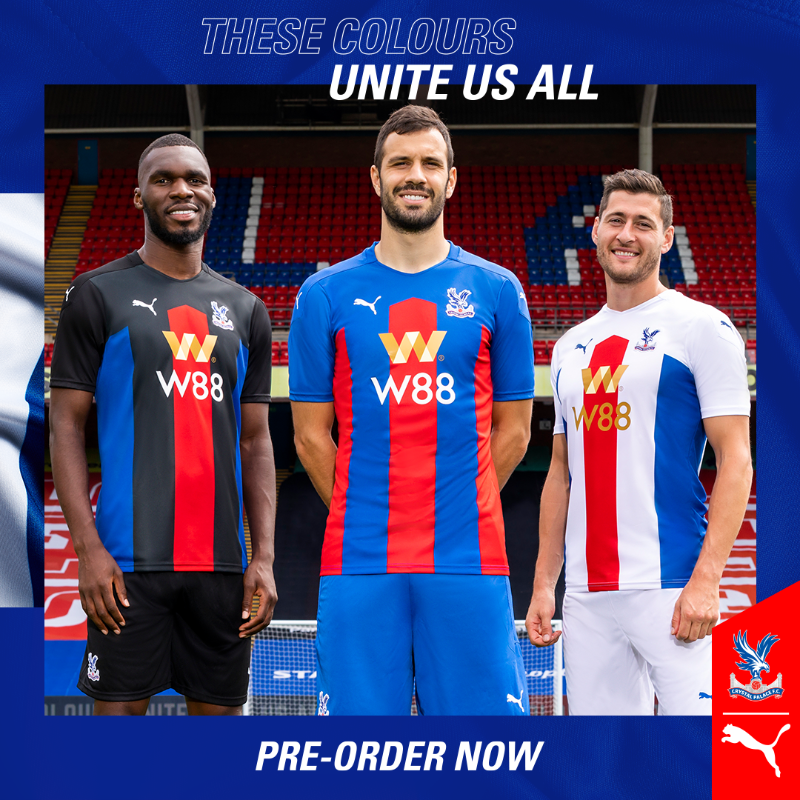
palace fans not exactly impressed with their new kit choices either.
Bit lazy at least with us though horrendous there is a contrast in style collar etc in both our kits.Blue and Red... White, Red &Blue... Black, Red and Blue...
Someone up at Puma Towers doesn't quite understand how colour clash works! They've ALL got red and blue in them!
...and as far as the slighty self righteous 'message' is concerned... why put Benteke in the black kit... and a white guy in the White kit?
By that logic, Papa Smurf should have been modelling the Blue/Red home kit!
Surely they're above all that?
Sometimes, advertising folk just try TOO hard to please!
My eyes, my eyes, i´m blind!
dundee United though it’s for charity.....Alzheimer’s

Used to have the Kappa ones from about 2005 but I - er - ‘grew out of them’ - the Puma ones we’re fine but like sails on me - the UA kit is probably the best made kit I’ve bought as replica.
The socks were really comfy, too

Hahaha, that's a good point.Blue and Red... White, Red &Blue... Black, Red and Blue...
Someone up at Puma Towers doesn't quite understand how colour clash works! They've ALL got red and blue in them!
...and as far as the slighty self righteous 'message' is concerned... why put Benteke in the black kit... and a white guy in the White kit?
By that logic, Papa Smurf should have been modelling the Blue/Red home kit!
Surely they're above all that?
Sometimes, advertising folk just try TOO hard to please!
It's probably because they're the same as the 1st kit!!Hahaha, that's a good point.
Have to say, I really like the 2nd and 3rd ones.
If you stare at it long enough, the sponsors logo starts moving!!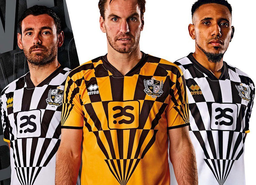
port vale, yikes
Ours looks quite tasteful in comparison (still don't like ours though).
port vale, yikes
They look like coloured barcodes (we're not the only ones that are suffering from bad designs.
palace fans not exactly impressed with their new kit choices either.
This being Castore's first ever football kit probably helped. And it is a lovely kit.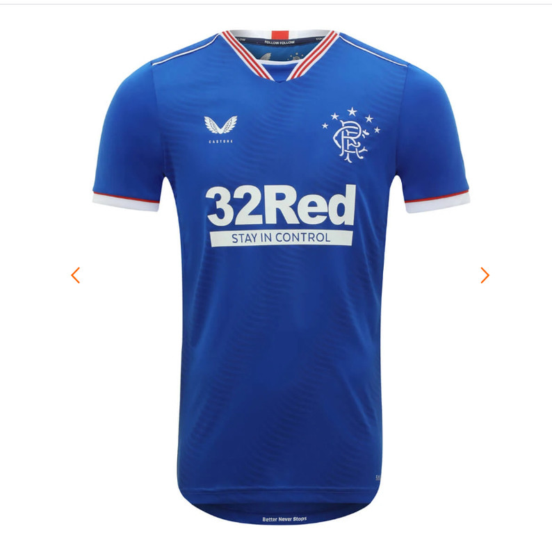
100;000 sold record sales fair play.....
That's why they only showed the top third in the 'sneak peek' pics!Is that real? Didn't expect the colour to change, if it is - flippin' 'orrible, IMO!
Blue & Red... White, Red & Blue... Black, Red & Blue...
Someone up at Puma Towers doesn't quite understand how colour clash works! They've ALL got red and blue in them!
...and as far as the slighty self righteous 'message' is concerned... why put Benteke in the black kit... and a white guy in the White kit?
By that logic, Papa Smurf should have been modelling the Blue/Red home kit!
Surely they're above all that?
Sometimes, advertising folk just try TOO hard to please!
")
 They missed an opportunity with the pink trim for that one.