
You are using an out of date browser. It may not display this or other websites correctly.
You should upgrade or use an alternative browser.
You should upgrade or use an alternative browser.
-
The Fighting Cock is a forum for fans of Tottenham Hotspur Football Club. Here you can discuss Spurs latest matches, our squad, tactics and any transfer news surrounding the club. Registration gives you access to all our forums (including 'Off Topic' discussion) and removes most of the adverts (you can remove them all via an account upgrade). You're here now, you might as well...
Latest Spurs videos from Sky Sports
I personally don't like it.
Simple can be good but this is simple to an extreme.
No pattern no nothing.
This is a very lazy design from Nike
No Spurs fan is ever happy, I guess.
If it's something different, it's "Not Spurs", if it's simple it's "Too simple"
What would you have liked?
Blue trim around the collar and sleeve? Isn't that a bit lazy too?
In all honesty, I loved these kits.

I loved the sash. I loved the gold trim, loved the Navy blue at the top. Still felt Spurs, but a bit more 'modern' so to speak.
That's my point I really like the 16/17. just some sort of pattern.No Spurs fan is ever happy, I guess.
If it's something different, it's "Not Spurs", if it's simple it's "Too simple"
What would you have liked?
Blue trim around the collar and sleeve? Isn't that a bit lazy too?
In all honesty, I loved these kits.
I loved the sash. I loved the gold trim, loved the Navy blue at the top. Still felt Spurs, but a bit more 'modern' so to speak.
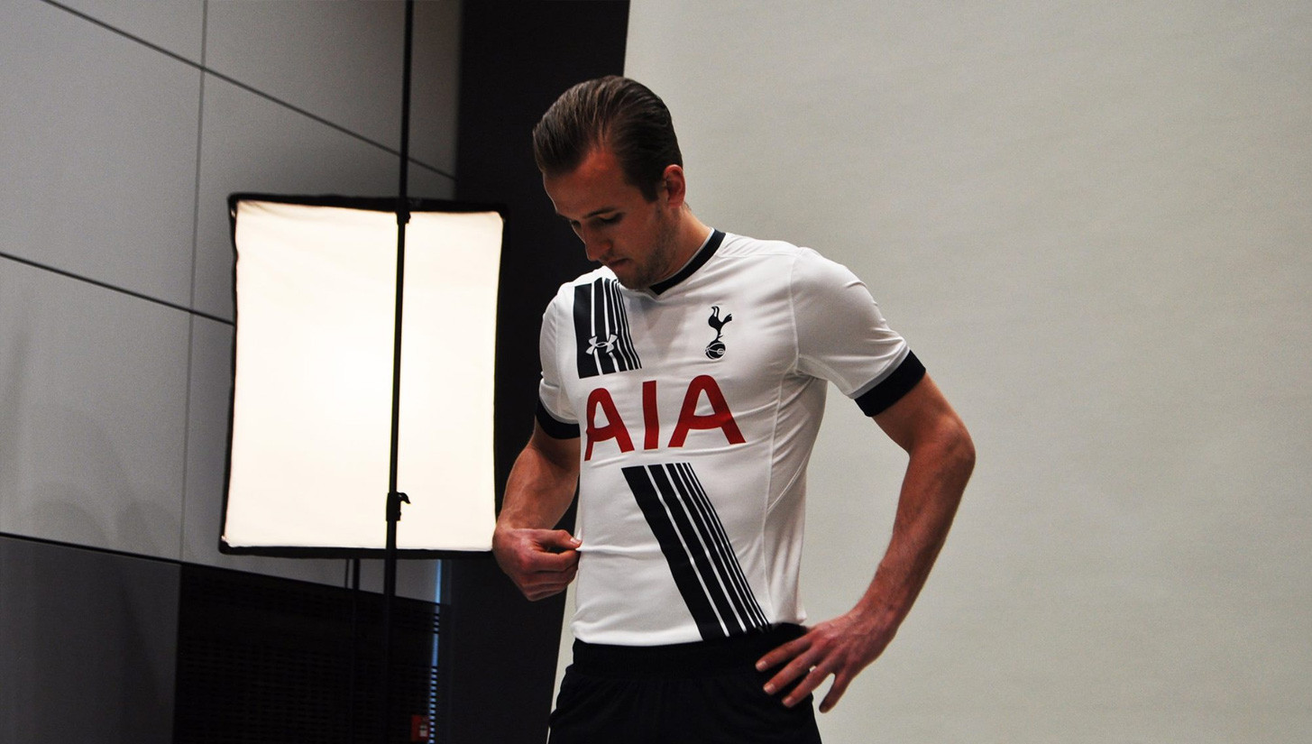
This new leaked kit is just a white kit with the badge and the sponsor logo. There is absolutley nothing on it.
That's my point I really like the 16/17. just some sort of pattern.
This new leaked kit is just a white kit with the badge and the sponsor logo. There is absolutley nothing on it.
I don't mind it, personally.
I quite like simplicity. I think it's likely looking to be a throw back to the 61 kit.. V-neck collar, navy blue shots and socks.
IMO you need something in the detailing of the shirt to balance out that red AIA. Funnily enough it's why I think this season's kit, though busy, is a bit of a grower (I know I'm in the minority on that one).No Spurs fan is ever happy, I guess.
If it's something different, it's "Not Spurs", if it's simple it's "Too simple"
What would you have liked?
Blue trim around the collar and sleeve? Isn't that a bit lazy too?
In all honesty, I loved these kits.
I loved the sash. I loved the gold trim, loved the Navy blue at the top. Still felt Spurs, but a bit more 'modern' so to speak.
This 21/22 Nike kit leak just comes across as passive aggressive to me. "Oh, you cunts didn't like the fade or the NFL-style navy shoulders, well fuck you we've made it entirely white this time".
For one, I don't think the pattern of the fabric in the neck lets that work properly. When Nike had a super simple year it was this one:

I suppose we'll have to wait and see how it looks on the players. I certainly won't complain like I did about the fade. What a shit shirt that was for a brilliant season.
Still got a few of them. UA was better quality, too. Especially the training gear.No Spurs fan is ever happy, I guess.
If it's something different, it's "Not Spurs", if it's simple it's "Too simple"
What would you have liked?
Blue trim around the collar and sleeve? Isn't that a bit lazy too?
In all honesty, I loved these kits.
I loved the sash. I loved the gold trim, loved the Navy blue at the top. Still felt Spurs, but a bit more 'modern' so to speak.
And you just know that’s what they’re going to do with all the other teams, too...That's my point I really like the 16/17. just some sort of pattern.
This new leaked kit is just a white kit with the badge and the sponsor logo. There is absolutley nothing on it.
Still got a few of them. UA was better quality, too. Especially the training gear.
The training gear was fantastic.
Here's the thing our new leaked kit is even simpler and it also looks very similar to this so what's the point of buying a new kit?IMO you need something in the detailing of the shirt to balance out that red AIA. Funnily enough it's why I think this season's kit, though busy, is a bit of a grower (I know I'm in the minority on that one).
This 21/22 Nike kit leak just comes across as passive aggressive to me. "Oh, you cunts didn't like the fade or the NFL-style navy shoulders, well fuck you we've made it entirely white this time".
For one, I don't think the pattern of the fabric in the neck lets that work properly. When Nike had a super simple year it was this one:
I suppose we'll have to wait and see how it looks on the players. I certainly won't complain like I did about the fade. What a shit shirt that was for a brilliant season.
Beautiful!!White White Binary Blue
Cuthbert Dibble Grubb.

Oh man.... I think the smug tone doesn't help you.... you shouldn't have to, cos you should already know we were around before the '70s!Complete and utter fallacy
You shouldn’t have to, because you should know, but google Tottenham Hotspur 70s/80s/90s and see how many photos have blue socks
Just cos none of us were around from 1900-1950 doesn't mean Spurs didn't have a kit! 1970s-1990s are a fraction of our 139 year History!
...but I guess if you're gonna be wrong, go big, eh?
I’m not really bothered that we had blue socks in 1910.....my childhood to adulthood, 44 years has been 90% white socksBeautiful!!
Oh man.... I think the smug tone doesn't help you.... you shouldn't have to, cos you should already know we were around before the '70s!
Just cos none of us were around from 1900-1950 doesn't mean Spurs didn't have a kit! 1970s-1990s are a fraction of our 139 year History!
...but I guess if you're gonna be wrong, go big, eh?
Even in the 60s they were 50/50 folded over halfway down the leg
Spurs isn’t synonymous with blue socks, because the fans from 1930 aren’t around anymore.
Maybe we should wear brown and yellow stripes at home
....and therein lies the problem...I’m not really bothered that we had blue socks in 1910.....my childhood to adulthood, 44 years has been 90% white socks
Even in the 60s they were 50/50 folded over halfway down the leg
Just cos it happened before our lifetimes, doesn't mean it didn't happen!
I quite liked the 50/50 folded over style... and hey, I wasn't even BORN then!
...and by that token, I assume you also only listen to music or watch films made in your lifetime... anything pre-1977 obviously doesn't count?
That would be an excellent idea! In fact, the Chocolate/Gold 3rd strip we had in the late 90s was inspired by that very kit.Spurs isn’t synonymous with blue socks, because the fans from 1930 aren’t around anymore.
Maybe we should wear brown and yellow stripes at home
We are a club built on History and tradition.... if we only focussed on the last 44 years, we wouldn't have much to shout about at all!!!
.....and that's the point!That's my point I really like the 16/17. just some sort of pattern.
This new leaked kit is just a white kit with the badge and the sponsor logo. There is absolutley nothing on it.
If I had my way, I'd make sure Spurs went back to something like this:
....or how about this for a modern take on a retro design?

...I'd love nothing better than a plain, clean, smart kit for ever and ever!
....but I'm not 'Mr Nike' OR Mr Levy, so I don't really get a say in all that!
Last edited:
That brown and gold was Jol era, and wasn’t nice....and therein lies the problem...
Just cos it happened before our lifetimes, doesn't mean it didn't happen!
I quite liked the 50/50 folded over style... and hey, I wasn't even BORN then!
...and by that token, I assume you also only listen to music or watch films made in your lifetime... anything pre-1977 obviously doesn't count?
That would be an excellent idea! In fact, the Chocolate/Gold 3rd strip we had in the late 90s was inspired by that very kit.
We are a club built on History and tradition.... if we only focussed on the last 44 years, we wouldn't have much to shout about at all!!!
We also wore red........thoughts?
Tbh I'm just one of those people who likes kits that have nice patterns etc......and that's the point!
If I had my way, I'd make sure Spurs went back to something like this:

....or how about this for a modern take on a retro design?
...I'd love nothing better than a plain, clean, smart kit for ever and ever!
....but I'm not 'Mr Nike' OR Mr Levy, so I don't really get a say in all that!
I guess I'm the minority rather than the majority as most of the people I've talked to agree with what your saying. Idk I don't really like plain kits but that's just me
Well it looks a lot better than the text logo for sureI still think if we had the AIA logo with the mountain & circle in more of a magentaish shade instead of woolwich red that it would be much better.

Or maybe my eyes are deceiving me and that's just as fuck off red as the simple AIA...